
Projects
Surrey Hospitals Foundation.

Proposed Donor Recognition Feature Wall
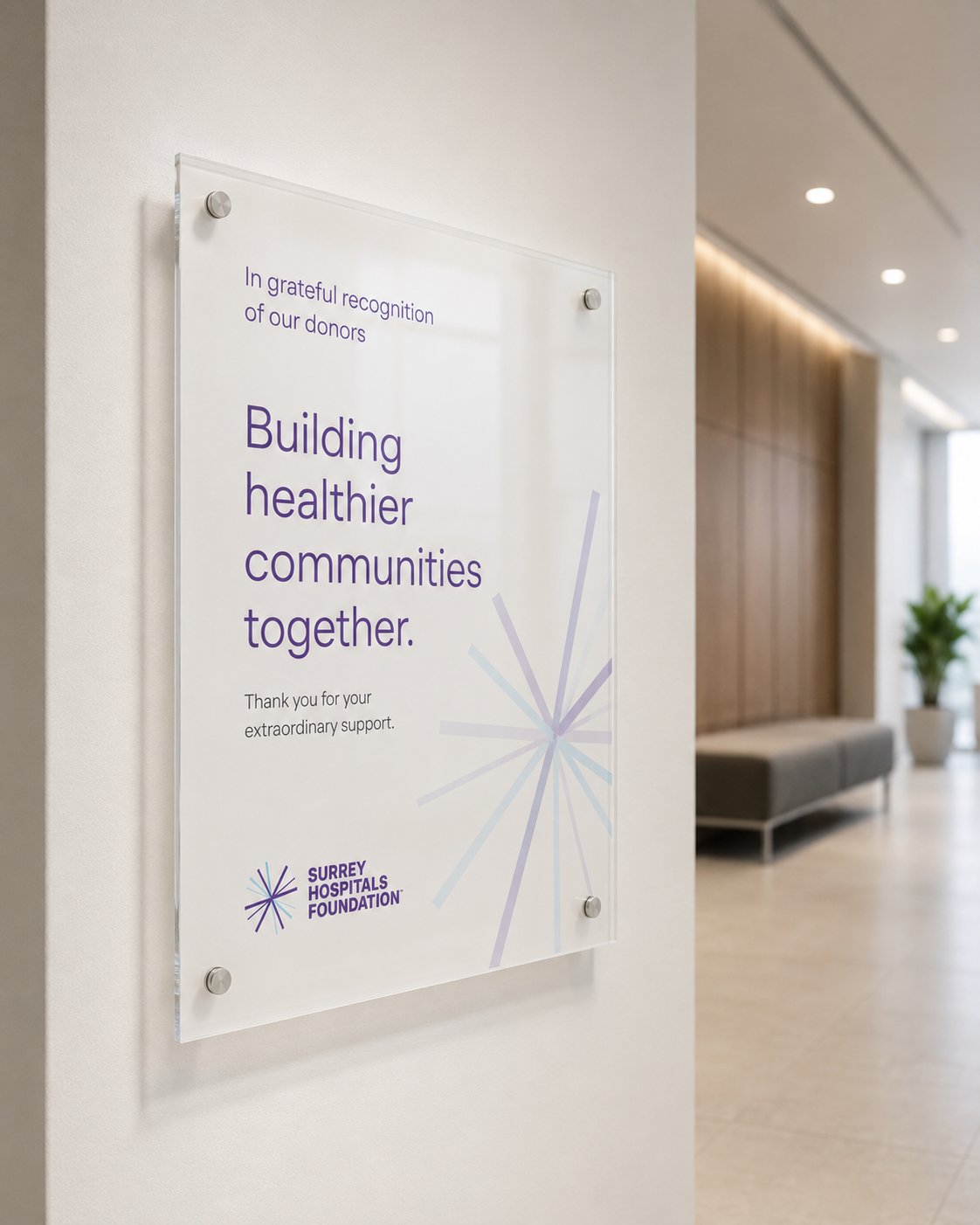
Donor Recognition Plaque
Project Overview
Surrey Hospitals Foundation partnered with our studio to evolve its established brand through focused updates to photography, typography, colour and supporting guidelines.
The refined visual language brings greater warmth, clarity and consistency to the Foundation’s communications.
Scope of Work
Brand Refinement • Brand Guidelines • Art and Photography Direction • Typography and Colour • Print and Digital Design • Environmental Graphics
Design Direction
Guided by the tagline We’re Here For You, the brand evolved towards a warmer, more human expression.
Naturally lit photography, rounded typography and a lighter colour palette create a visual language that feels approachable, compassionate and connected to the community.

Case for Support Booklet

Shuttle Bus Wrap
Selected Applications
The refined system was applied across annual reports, digital templates, environmental graphics and donor communications—creating a cohesive experience across every touchpoint.

Selected applications across brand touchpoints.
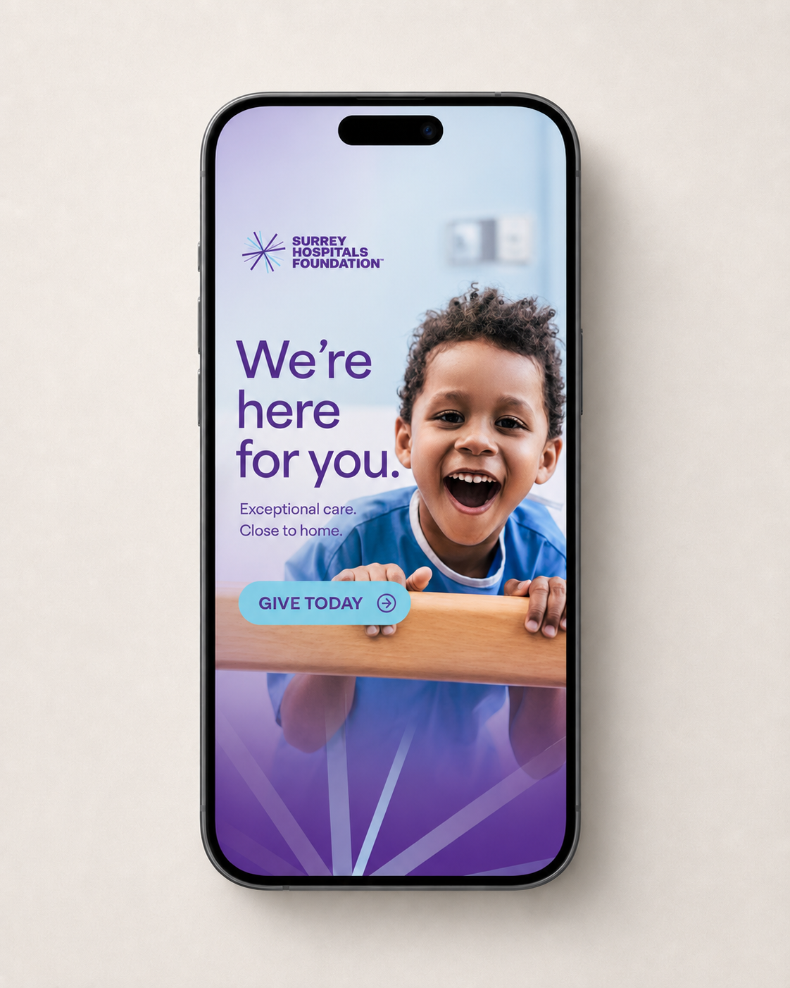
Digital Ads & Social Content

Transit Shelter Ads
Project Notes
A considered evolution of the Foundation’s existing identity, preserving its recognition while bringing greater warmth and consistency to the brand.

Surrey Hospital Foundation Brand Guidelines
Contact Us.